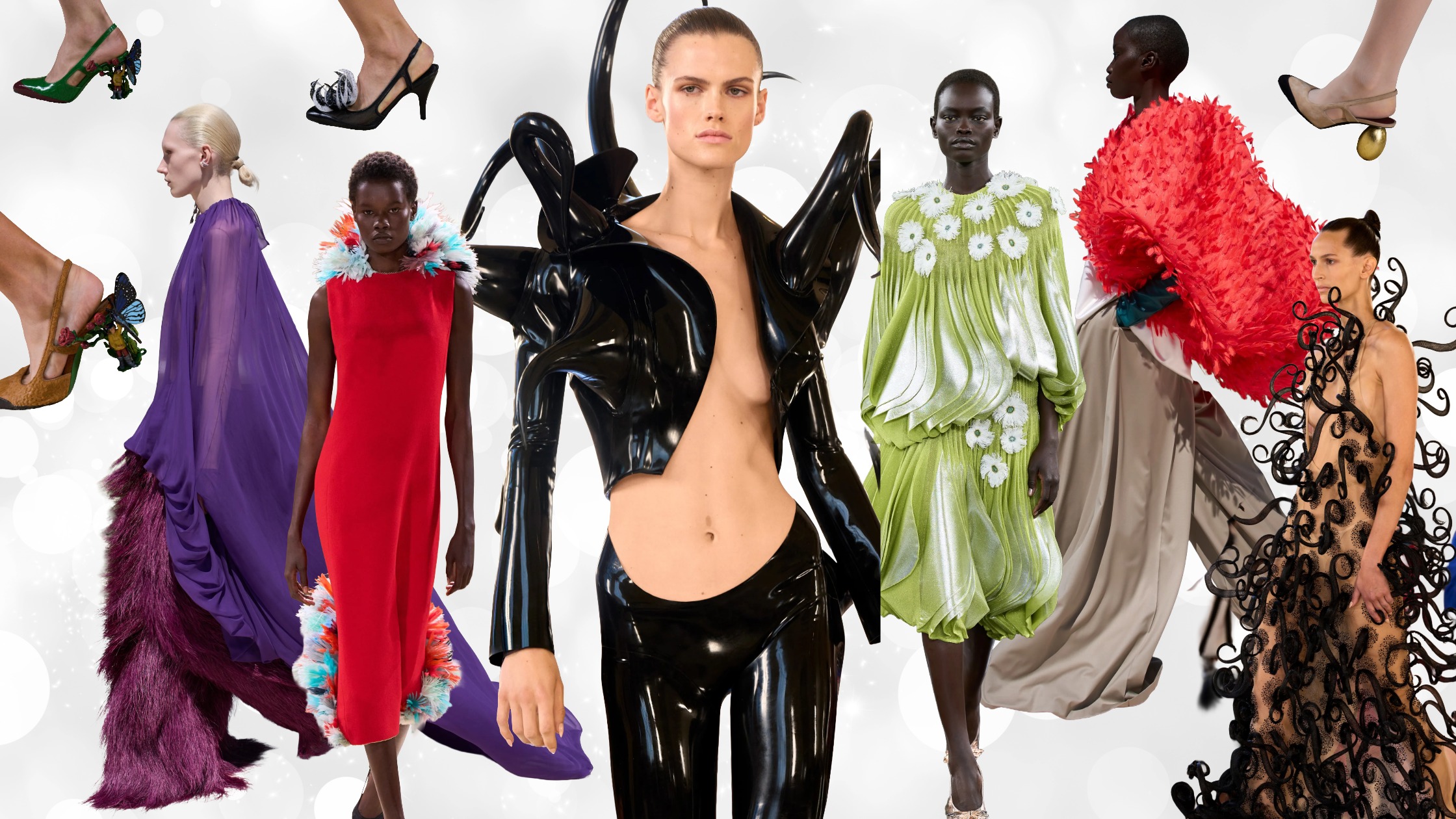
There is one aspect of fashion that will always be present, regardless of price points, moments of recession or economic booms, and the social context of our world. This aspect is color. The use of color in clothing is more often than not a determining factor in whether we decide to try a piece of clothing or not. It is the reason why many times, someone's outfit gets our attention in the first place. Maybe it's an exciting color combination or a color you haven't seen in a while.
Our experiences and our history determine how we react to these colors, and our anatomy and personal taste will decide whether we feel comfortable with a color or not.
Brands are taking fashion colors seriously. Because there's more competition than ever in the fashion industry, every aspect of fashion pieces needs to be flawless and impeccable in order to stand out.
This is why fashion brands are using color not just to create successful pieces to sell. They are using colors to establish a strong brand identity that makes them recognizable worldwide. In addition to logos and monograms, a fashion color is an ultimate distinguisher among a wide variety of fashion goods.
"Color is a power which directly influences the soul." Wassily Kandinsky
But how do you make people like this one color fashion brands choose?

The great thing about color as an element of brand identity is that it is truly versatile. There are only a few things you can do with a logo, like changing the size or its placement. But when a brand is recognized by its color, the possibilities are endless.
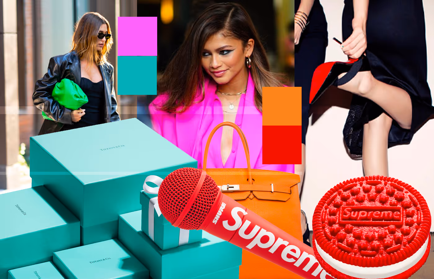
Hermes made a pop-up shop with all things orange, from the furniture and the signs to the food and the invites. Tiffany's iconic blue boxes are recognized without even seeing the logo. Christian Louboutin has made hundreds of footwear iterations, evolving with fashion trends while keeping its iconic red sole.
Colors can be applied to social media filters and colorize experiences that convey the story that a fashion brand wants to tell consumers. In such a visual world with instant videos, stories, and images everywhere, color is remembered when it is presented in a special way. Let's take a look at some cases where fashion brands used color as a way to create or enhance a solid brand identity that makes their products recognizable around the world.
The Little Blue Box from Tiffany & Co.

Charles Lewis Tiffany founded with his partner J.B. Young this worldwide known company, originally called Tiffany & Young, in 1838. Only a few years after its foundation, Charles Lewis Tiffany introduced the signature blue color for which the brand is now recognized. There are several theories about why the founders chose this very specific blue. One of the most accepted theories is that turquoise was very popular in the jewelry of the 19th century, particularly among Victorian brides.
Tiffany & Co. became a favorite destination for New York's elite, some of the wealthiest people in the country. The idea of luxury and uniqueness has been prevalent in the brand ever since, and this idea translates to the whole shopping experience, including the packaging.

Since the early years, the founders took packaging seriously and wanted to make it as unique as the products they were offering. This is how the famous little blue box was created. One of the reasons these boxes are so desirable is that there's no amount of money that will get you a little blue box by itself. Across the world, in all official Tiffany & Co. distributors, all employees have the indication of giving only a blue box when a client buys a product from them. No extra boxes, no additional costs, and no chance of buying an extra box. Of course, this exclusivity has opened doors to a lot of resellers of blue boxes for people who simply want the package as an aspirational symbol without the product inside.
It's hard to distinguish an authentic little blue box from one that was simply sent to any manufacturer to be constructed and painted with a similar shade of blue. The original Tiffany & Co. boxes have little letter t's engraved all over. Although any manufacturer can do this engraving without getting sued, you'll be able to tell with a box with no engravings, that it is simply a cheap copy. (The Packaging Insider).
Tiffany Blue is now registered as a color trademark with a Pantone custom color created exclusively for Tiffany & Co., so it is not available publicly.
This is how this jewelry company used color to tell a story of New York luxury. The brand has been present in iconic pop culture moments like Breakfast at Tiffany's with Audrey Hepburn, Charlotte York's first marriage proposal in Sex and the City, or Lady Gaga wearing a 30 million dollar historic jewelry piece at the Oscars 2019. Tiffany & Co. knows how to tell a story through color, a story that many people around the world are familiar with.

The luxurious jewelry brand, with almost two centuries of history, made a bold move to establish a brand identity that was definitely ahead of its time: making Tiffany blue.
The Valentino Pink PP Case

Earlier this year, Valentino's pink show got everyone's attention by choosing a hot pink shade as the main character of the show. With the true idea of monochromatic in mind, the stage, the clothes, the makeup, the accessories, and the furniture were all covered with this vibrant pink. This is not the first time that this fashion house relies on color to tell a story. However, this time, it became a widely recognizable statement because, within a matter of weeks, we started seeing monochromatic hot pink, red carpet looks. It didn't take long for the press and fashion followers to realize these celebrities were wearing Valentino.
Even though the fashion house played with textures and proportions, the looks are mainly monochromatic, and with such a vibrant color, there's only so much that you can do with this hot pink without it looking repetitive. It only took a few weeks for fast fashion brands to knock off these designs and have them available in their cheap interpretation. Still, by the time this Valentino pink made it to the knock-off racks, the Italian fashion house had already moved on to something else.


Valentino's hot pink show taught us that color can tell a story and communicate a message when it is used wisely. The clothes we saw at the Valentino Pink PP show were only used by a small fraction of the 1% of the population who makes red carpet appearances and is willing to pay high prices for a temporary trend. However, the images of these people wearing the clothes traveled across social media platforms, becoming a very successful advertising campaign for the Italian fashion house, which has been in danger of being seen as obsolete or "for the elder" in recent years. The Valentino Pink PP collection encouraged other fashion houses to use bold colors for their shows and use color as a key element in their designs. It is true that no fashion house can rely solely on color to make fashion statements and keep relevant in such a fast-paced industry. Still, it is fun to push the boundaries on how important color can be in enhancing and solidifying a brand and making its products recognizable by simply looking at the color.

The Serendipity Behind Hermès’s Orange

It's fascinating to take a look at history and realize that many success stories didn't start with the desire to be successful in the first place. During a very uncertain and challenging time in Europe, with the Nazis taking over France and affecting the supplies for thousands of businesses, people were doing their best to keep their businesses going, if possible, with the resources they had available at the time.
Before this invasion, Hermes was using faux pigskin boxes for their packages, a decision that Thierry Hermès's grandson felt sure about. But as resources became unavailable and the budget decreased, faux pigskin boxes to package the fashion goods weren't a priority. This was when the fashion house's team had to work with paper and orange dye to make boxes, and this is how the iconic orange boxes to package Hermès bags were created.

Hermès leveraged its fashion color to create experiences. They are now opening gyms in big cities like New York and Los Angeles to share the
The orange boxes became an extension of the fashion house, a truly recognizable element when people in France carried them on their way home. So when the supply distribution resumed, and more resources became available again, the Hermès team decided to keep their orange boxes and packages, an important symbol for the brand that, to this day, is recognizable when people carry them around Rodeo Drive or Fifth Avenue.
Is Supreme More than a red logo?

Supreme opened its doors in April 1994 in Downtown Manhattan. With the vision of creating a space to celebrate skate culture, the fashion brand has collaborated with other fashion brands and companies, creating collections with very limited pieces that end up being pieces of high interest at high prices.
Supreme is not the first or the last fashion brand to use red in a ubiquitous manner. However, the design team has managed to create a strong minimal aesthetic that consumers are attracted to and is recognized by consumers.
Supreme's products don't come at an affordable price. Many products from previous collections are now reselling to tens of thousands of dollars, and many people are willing to pay that price for these products. So Supreme's red gives a certain status to the user. It is not necessarily elegant since that's not the vibe that the brand is going for, but it is exclusive, special, and part of an ephemeral moment in fashion with limited edition collaborations.

It will be interesting to see what happens with this brand in the upcoming years since they have limited their designs to a very minimalistic approach with a white and red logo, and there isn't any fashion-forward idea in their clothes. That is the challenge with color; with so many possibilities of what designers can do with it, sometimes, they end up doing the same thing over and over, and eventually, the client gets bored and moves on to another brand with a similar aesthetic and a broader vision of fashion.
After a certain period, brands re-evaluate if the color or colors they are using are still representing their brand. Because, after all, fashion represents the people, and if they are no longer connected to the clothes that brands present, the brand is in danger. There have been cases where fashion brands decide to take another direction, using a slightly different color, or completely going in another direction. It all depends on what consumers are interested in, their passions and concerns, and how that can be represented through color. Fashion brands invest a lot of money in research to get this information because choosing an unsuccessful color can be a huge financial tragedy for a company.
As in that famous scene from the Devil Wears Prada where Miranda Priestly describes the cycle of fashion in an intriguing conversation around choosing cerulean belts for a fashion shoot, all decisions are relevant in fashion. All the colors around us were chosen carefully to be attractive to our eyes. That is the magic of design. That is the magic of color.
"Color helps to express light—not the physical phenomenon, but the only light that really exists, that in the artist's brain." Henri Matisse